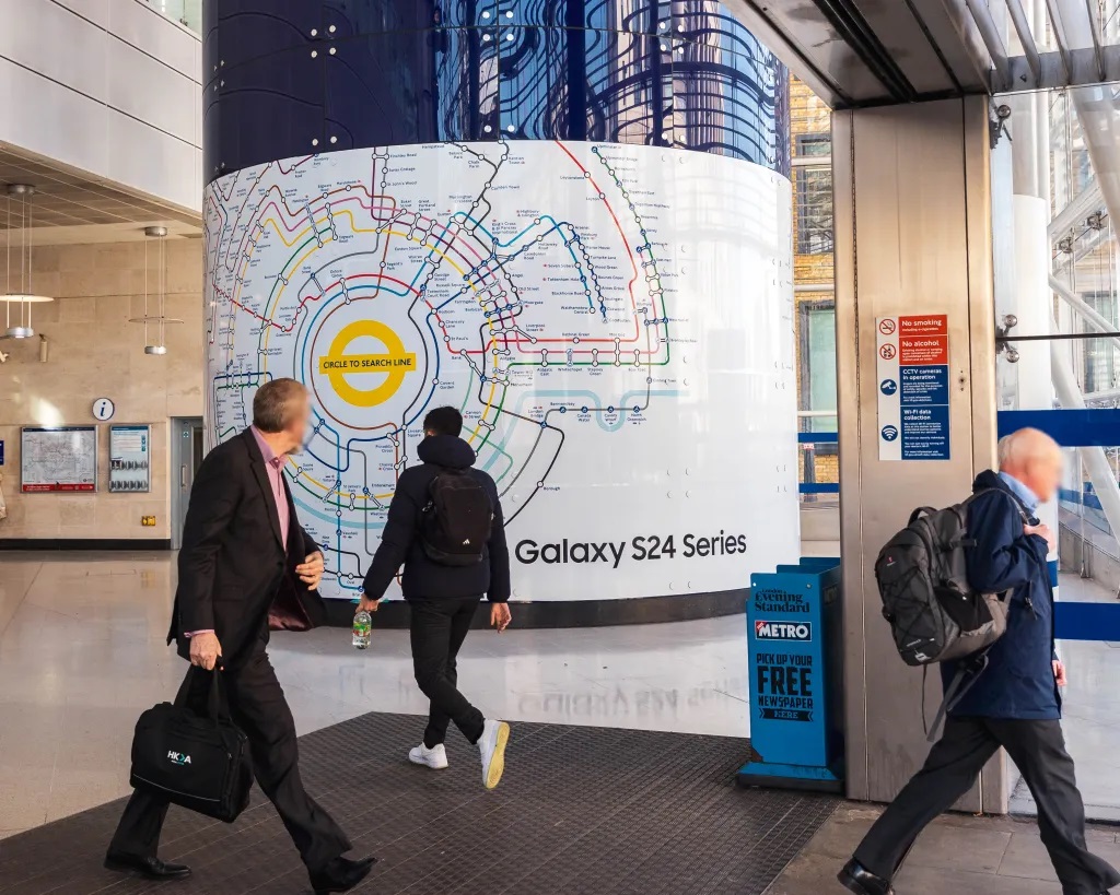
The Circle to Search design adopts a minimalist and subdued approach, with a softer, more muted colour palette. This new design prioritises a sleek, modern aesthetic, but at the expense of some of the functional clarity that defines the old map, writes Ricci Dean.

The comparison between the new Circle to Search design and the classic London Underground map is debatable. Both maps aim to simplify complex information, but they approach this challenge in distinctly different ways, particularly in terms of colour usage and overall clarity.
The traditional London Underground map is a triumph of practical design, especially in its use of colour. Each line is identified by bold, distinct colours that aren’t just visually appealing but essential for quick, effortless navigation. The high-contrast palette ensures that, even in crowded or stressful situations, users can immediately locate the line they need. This approach has stood the test of time because it’s both functional and intuitive, making one of the world’s most complex transport systems remarkably easy to navigate.

In contrast, the Circle to Search design adopts a minimalist and subdued approach, featuring a softer, more muted colour palette. This new design prioritises a sleek, modern aesthetic but at the expense of some of the functional clarity that defines the old map. The colours are less distinct, with an emphasis on creating a cohesive look rather than making each line instantly recognisable. While this might appeal to a contemporary audience accustomed to digital interfaces, it risks reducing the map’s effectiveness, particularly for those who rely on strong visual cues to navigate the Underground’s intricate network.
Change in design can bring fresh perspectives and modern solutions, but practicality should never be sacrificed in the process. The shift from bold, contrasting colours to a more uniform palette raises concerns from a usability standpoint. While the new design might seem elegant, it sacrifices the immediate legibility that made the original map so successful. The strong colour differentiation in the traditional map is not just a stylistic choice; it’s a critical element of its functionality. The new design, with its softer tones, may blur these distinctions, making it harder for users to quickly identify different lines and understand the network.
Moreover, the way these maps present information is telling. The old map offers a complete view of the system, allowing users to see the entire network. This holistic perspective is crucial for understanding not just individual routes but how they connect across the city. The Circle to Search design, with its focus on specific areas, can obscure this broader context. Combined with its muted colours, this approach may leave users with a less clear understanding of their position within the larger network.
While the Circle to Search design offers a fresh and modern take, it falls short of the clarity and functionality that the classic London Underground map provides. With over 25 years of experience in graphic design, I recognise the importance of change but also the necessity of practicality. The old map’s bold use of colour and clear, user-friendly design remain unmatched, serving as an enduring model of effective information design.
(Ricci Dean is a London-based media professional with extensive experience in graphics and animation.)
ALSO READ: Black On The Square


